
A more premium public experience for serious travel operations
Dumcheese now presents route discovery, request capture, documents, and payment verification through a richer interface with deeper visual hierarchy, stronger graphics, and a clearer sense of operational trust.
Request Deck
DC-20260405-A21
Visual Control
Search, request, documents, and payment in one modeled surface
Discovery surfaces
Routes and schedules stay useful, but the UI stops short of fake booking promises.
Request capture
Passenger details, route context, uploads, and support notes move into one structured record.
Operations review
Admins compare portal results, manage follow-through, and keep the request number central.
Documents and payment
Tickets, invoices, payment states, and client tracking stay visible instead of vanishing into email.
The visual language now feels built, not assembled
This pass shifts Dumcheese from a functional marketing page into a more editorial, atmospheric, and premium public experience while keeping the request-first business model intact.
3D Hero Scene
Layered depth instead of flat brochure cards
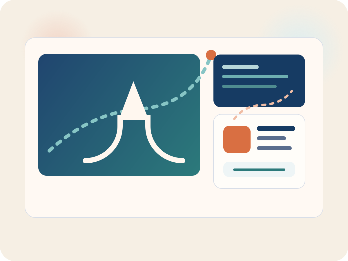
The landing surface now feels modeled and intentional, with motion, perspective, and premium color transitions that frame Dumcheese like a serious travel operations brand.
- Interactive parallax composition
- Glass surfaces with depth
- Route, request, and document signals in one scene
Discovery Layer
Search remains honest while looking far more premium
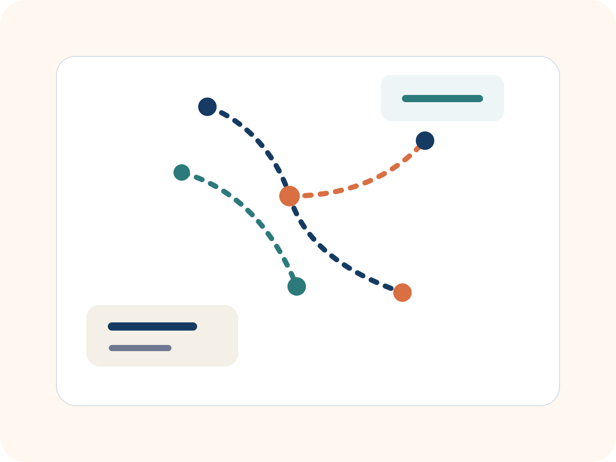
The public site still respects the request-first model, but the visual treatment now explains discovery, review, and conversion with much more confidence.
- Clear route-exploration framing
- No checkout mimicry
- Faster path into request submission
Document Layer
Tickets, invoices, and payment checkpoints are first-class visuals
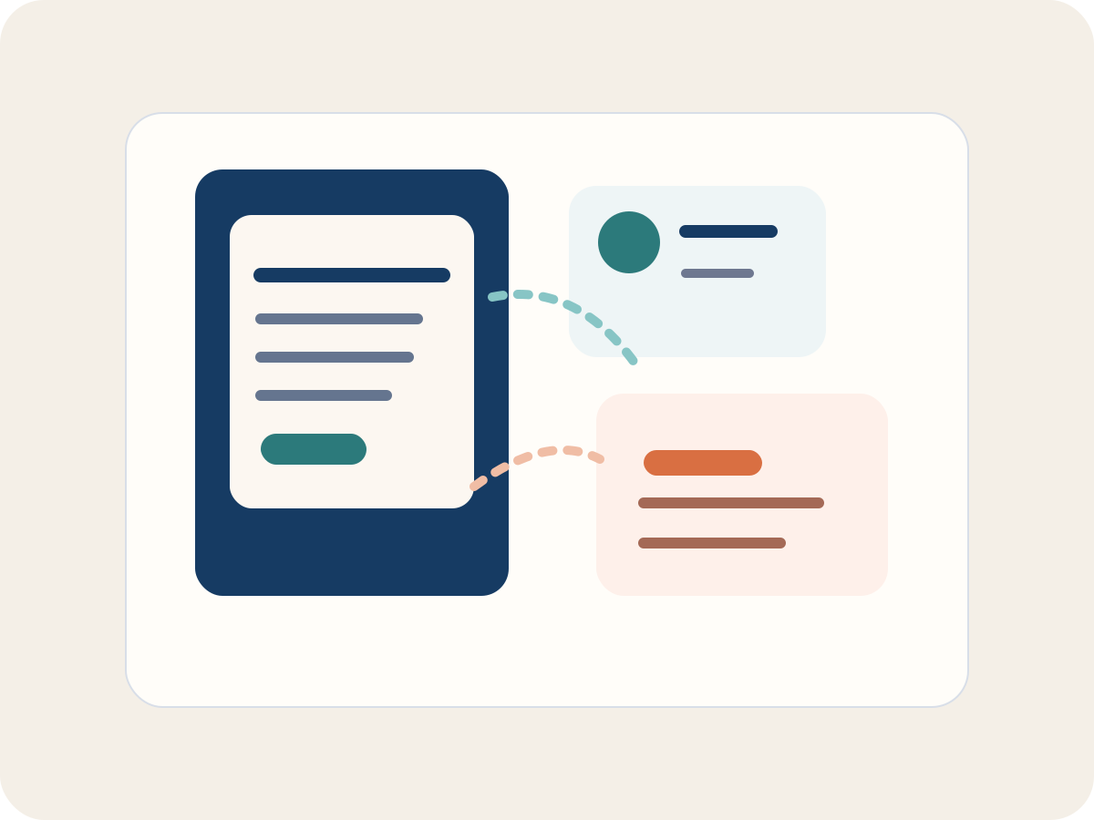
Support, billing, and issuance cues are now embedded into the design system instead of being hidden behind plain text or generic cards.
- Invoice-aware interface blocks
- Tracking-ready status surfaces
- Request-linked document language
Trust Layer
Premium styling without losing operational truth
The redesign uses richer graphics and stronger sections while preserving Dumcheese’s core message: admin-managed travel, manual review, and verified payment.
- Professional corporate tone
- Human review stays explicit
- Admin control remains intact
A travel flow that now looks as structured as it actually is
The redesigned public experience gives the workflow more depth, more hierarchy, and more visual confidence while keeping every stage tied to the request.
Explore routes
Use the public discovery flow to understand schedules, then move directly into a structured travel request.
Submit request
Share passengers, route details, documents, and any special instructions in one place.
Operations review
Dumcheese compares supplier options, confirms the plan, and manages fulfillment through internal workflows.
Receive documents
Issued tickets, invoices, and payment confirmation stay attached to the request for visibility and follow-up.
More sections, more visual layers, more premium signal
Instead of relying on plain stacked cards, the homepage now uses broader section contrasts, modeled surfaces, and graphic storytelling around route discovery, support, and document delivery.
Premium composition for discovery, request capture, and client confidence
The design now layers route graphics, glass panels, status surfaces, and editorial content blocks so the site feels closer to a branded product experience than a thin brochure.
Advanced hero depth with orbital motion
Document and payment cues built into the layout
Stronger surface contrast for clearer reading rhythm
More branded graphics without fake travel-deals styling
Public discovery stays separate from internal fulfillment
The site looks elevated and high-end, but it still communicates clearly that final booking is handled after review.
Billing and document flow are visually visible
Invoice, ticket, and payment checkpoints appear as part of the interface story, which makes the workflow feel more complete and credible.
Payment verification is built into the brand signal
The design now reinforces that payment moves through pending, received, and verified states before a request is truly complete.
A public experience that feels credible to real travel teams
The goal is not decoration for its own sake. It is to give Dumcheese a public-facing interface that looks polished enough for companies, NGOs, and operators who care about process.
Corporate teams
Built for coordinators who need serious presentation, clear request ownership, and document-friendly travel support.
NGOs and organizations
Designed for teams that need clarity, accountability, and a cleaner operating rhythm than scattered calls and spreadsheets.
Founders and operators
Useful for lean teams that want travel handled with polish and structure without building an internal travel desk.
A better-looking Dumcheese that still behaves like Dumcheese
The new public UI adds premium motion, stronger section design, richer graphics, and 3D-style surfaces while keeping the real model clear: discover routes, submit a request, let operations review, receive documents, verify payment.